DESIGN LIBRARY · SEPTEMBER 2026
20 new layouts. Your brand in every one.
From Offers, open an offer and find Choose your checkout design. Browse the library or choose a design from the list. Layout controls the arrangement; your brand colours are separate.
- Choose a structure. Editorial rail, Product gallery, Guided steps and the other designs arrange your content in distinct ways. Choose “Use classic layout above” to return to Standard, Compact or Hero.
- Make it yours. Set the brand accent, page background and panel background with six-digit hex colours. Blank fields use the defaults. Text contrast adapts to your colours.
- Add the details. Set your main image, up to five gallery images, a direct HTTPS video for Cinema, or up to eight titled story sections. Use sections for a course outline, product materials or purchase details.
- Preview before saving. Preview full design opens your unsaved appearance with the saved product price. Switch between Desktop and Phone, explore the steps or drawer, and close the preview to keep editing. Previewing creates no charge or order.
- Save and test. Save changes, then use the simulated test to review the full purchase journey. Changes to a shared product’s price or delivery still use the separate product review.
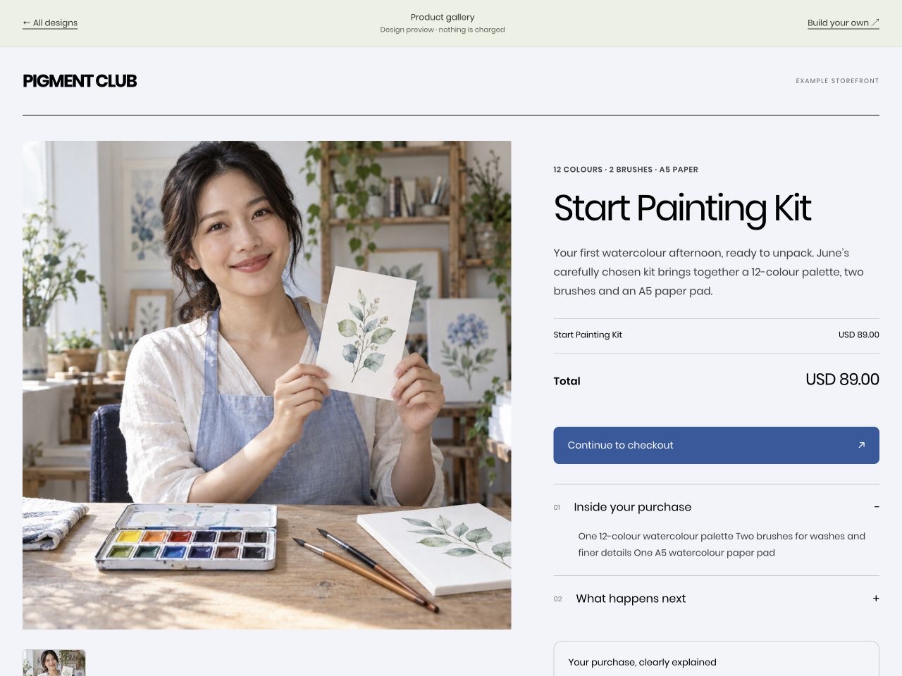
Layout choices
| Design | How it works |
|---|---|
| Editorial rail | A story, a section index and a persistent checkout rail. |
| Product gallery | An expansive product gallery with checkout in a drawer. |
| Guided steps | Details, optional extras and payment in three calm steps. |
| Side drawer | A full offer page with a checkout drawer alongside. |
| Cinema checkout | A cinematic media stage with payment beneath the story. |
| Curriculum checkout | A course introduction and expandable lesson outline. |
| Plan picker | Configured offers as cards, followed by the selected checkout. |
| Bundle builder | Product and optional-extra selection with an order rail. |
| Full-bleed canvas | Immersive brand artwork with a floating checkout panel. |
| Inline offer accordion | A list of offers that opens into the selected purchase. |
| Centerpiece | A centred product, flanking benefits and a wide payment band. |
| Ticket | An event-style ticket with a distinct price stub and payment below. |
| Chapter bands | A sequence of full-width sections from offer to payment. |
| One question at a time | A focused sequence with one question before each next step. |
| Express first | A compact order and prominent available payment methods. |
| Magazine spread | An editorial cover, asymmetric story and checkout at the foot. |
| Comparison checkout | Compare explicitly selected offers, then complete the chosen one. |
| Expandable purchase dock | A full story with a bottom purchase dock and payment sheet. |
| Three-panel checkout | Buyer details, payment and order in three clear columns. |
| Modular mosaic | An asymmetric composition of image, story and checkout tiles. |
Offer choices and bundles
Plan picker, Comparison and Inline offers show the current offer plus up to three offers you explicitly select. Other choices must be live single-product offers in the same account and currency. A choice opens its own checkout, with its own price, renewal and delivery terms. Archived or unpublished choices disappear automatically.
Bundle builder uses the existing cart’s selectable items or a single offer’s optional extras. The layout does not create products or change prices. Buyers retain control over selections; live totals come from the server.
Images, physical products and payment methods
Use photographs that you own or have permission to use. Physical product examples show seller-arranged collection or fulfilment. These designs do not add shipping labels, stock management or an address-collection service. State your delivery arrangements clearly.
Express first gives connected payment methods a prominent place. Actual methods depend on your payment account, offer and buyer. The library’s example wallet is an illustration, not a promise that every method is available.
01 — The shape
Three layouts
Pick one per offer from the Template column on its row in the Offers table. The change saves the moment you choose it — there is no Save button.
| Template | What it is | When |
|---|---|---|
| Standard | Two columns: the story and price on the left, payment on the right. On mobile, read the offer first and use Continue to payment to jump to the form. | The all-rounder. Start here. |
| Compact | One narrow column at every width. | A buyer who already decided. Low-price, quick purchases. |
| Hero | A full-width banner image above both columns. | When you have a real image worth leading with. |
Below 900px there are no columns at all: the story comes first and the form second. On a phone your guarantee is read before your email field, which is worth knowing when you write it.
02 — The parts
The blocks, and where they land
Eleven things are yours to set. Each has a fixed home, so the only decision is what to say.
| Block | Where it renders |
|---|---|
| Banner image | Top of the story column — or above both columns on Hero. |
| Headline | Story column, replacing the product name. |
| Subheadline | Under the headline. |
| Bullets | Ticked list under the subheadline. |
| Testimonials | Story column, below the order summary — beside the form on desktop, above it on a phone. |
| Guarantee | Foot of the story column. Not beside the pay button. |
| Deadline | Form column, above the card fields. |
| Button text and accent | The pay button. The accent tints that button and nothing else. |
| Legal note | Under the pay button, before payment — and repeated on the receipt. |
| Layout | Which of the three templates above. |
The order summary, the tax line and the bump box are not yours to place: the server computes them and puts them where they go. See the block map for the whole page drawn at once.
03 — Doing it
Putting it on your site
Three ways, and the first is usually right.
- Hosted. Send the buyer to the checkout link. No script, works everywhere — including inside an email, where the other two cannot go.
- Lightbox. A button on your page opens the checkout over it. Keeps them on your site.
- Inline. The checkout renders inside your own page.
04 — Before a buyer does
Seeing it first
Every offer ships a test URL alongside its real one. It renders exactly what a buyer sees, with a yellow bar across the top that says so — no card, no charge — and you can click all the way through to the thank-you page.
Use it to check the words, the layout and the delivery before anything is live. The pre-payment legal notice renders in test mode too, so you can confirm that as well.
04b — Language
What language your checkout speaks
Your checkout can run entirely in German. Set it once in Settings → Defaults → Checkout language and the whole buying flow follows: field labels, the pay button, trial sentences with properly localized dates, coupon and card-decline messages, discount countdowns, the thank-you page, and the buyer's receipts.
Three rules worth knowing:
- You choose, not the buyer. There is deliberately no language switcher on the page — your checkout is your storefront, and the merchant setting decides. English is the default.
- Your own words are never translated. A custom button label or offer copy you wrote yourself renders exactly as you wrote it, in any language. Clear a custom label to get the translated default.
- It applies to checkouts, not your dashboard. The dashboard stays in English; the setting is about what buyers see.
German is the first language because merchants asked for it — the machinery underneath is general, so tell us which language you need next.
05 — Diagnosis
If something looks wrong
I picked Hero and nothing changed. No banner image — see above. Hero without one is Standard.
My testimonials are not under the form. They are not meant to be: they live in the story column, beside the form on desktop and above it on a phone.
The accent colour barely changed anything. It tints the pay button. The guarantee box, the bump and the deadline pill have fixed colours.
The code box is missing. No coupon currently applies to that offer — see when the code field appears.
06 — Next
Where to go next
Bumps and upsells, carts and bundles, or the full block map.